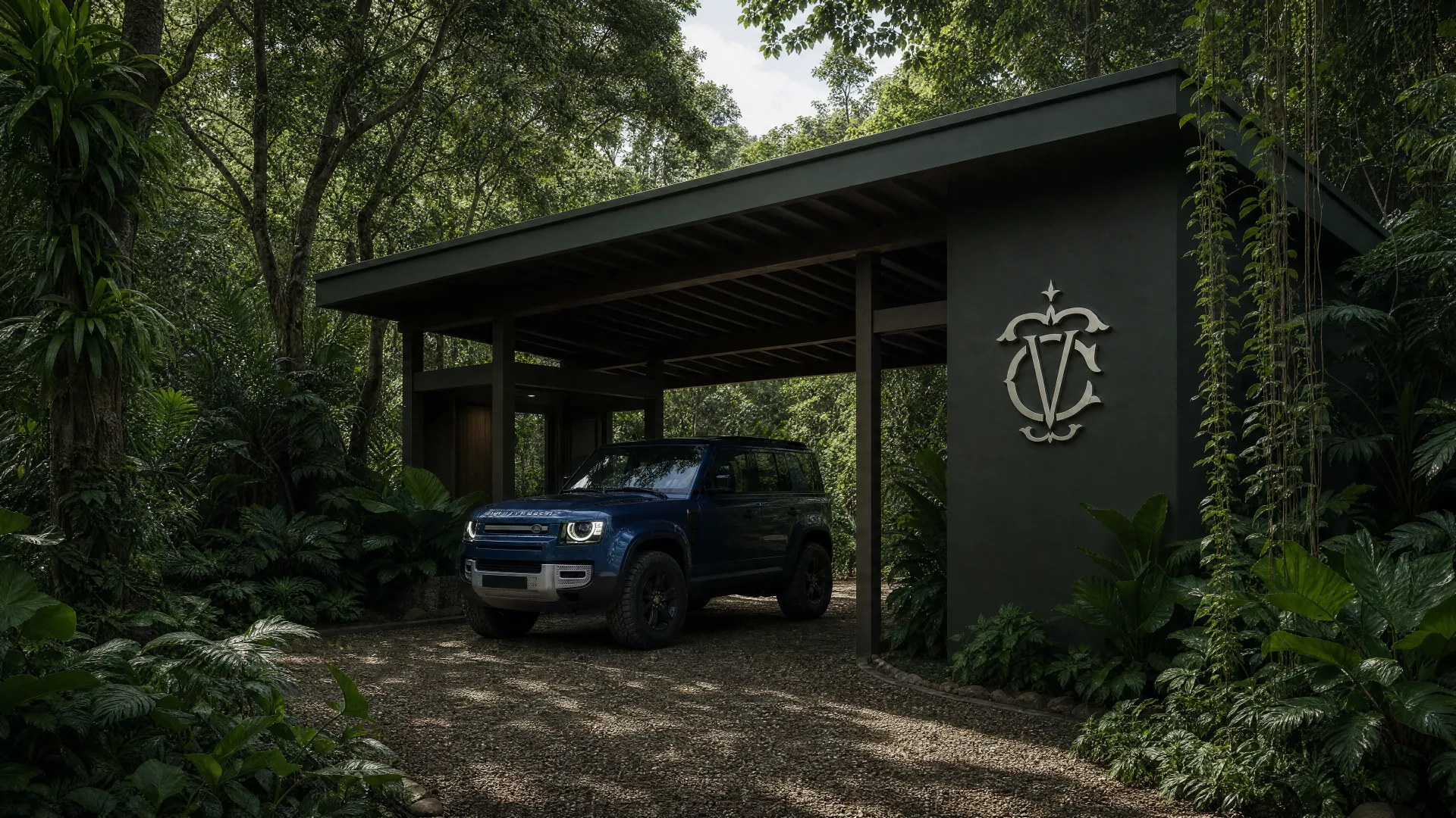
A luxury retreat on Costa Rica's South Caribbean coast, built on ancestral Bribri land. The culture was the foundation, not the inspiration. The brand had to come from 10,000 years of living tradition, or it would ring false on every surface it touched.

The territory
The Bribri people have lived on this coast for millennia. Their world is organized around Sibö, a creator deity present in every living thing: the forest, the river, the seed, the sun. Siwä is a word from that lineage. The land had meaning before the first stone was laid, before the first guest arrived, before anyone sat down to design a brand.
The question wasn't how to differentiate in a crowded hospitality market. It was whether a brand could be built from something ancient without diminishing it. That question demanded a different starting point: the culture itself, as the brief.
The work
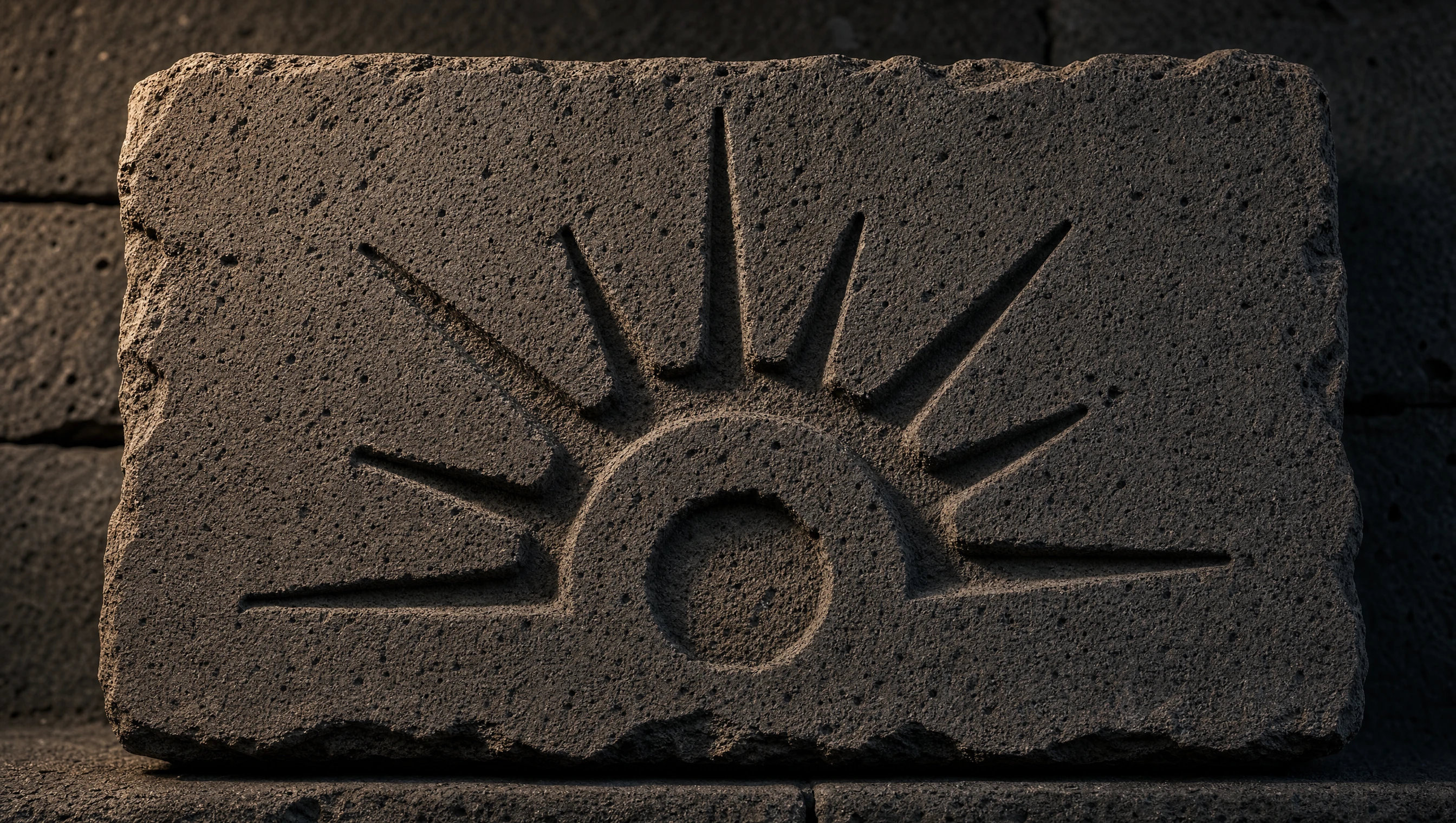
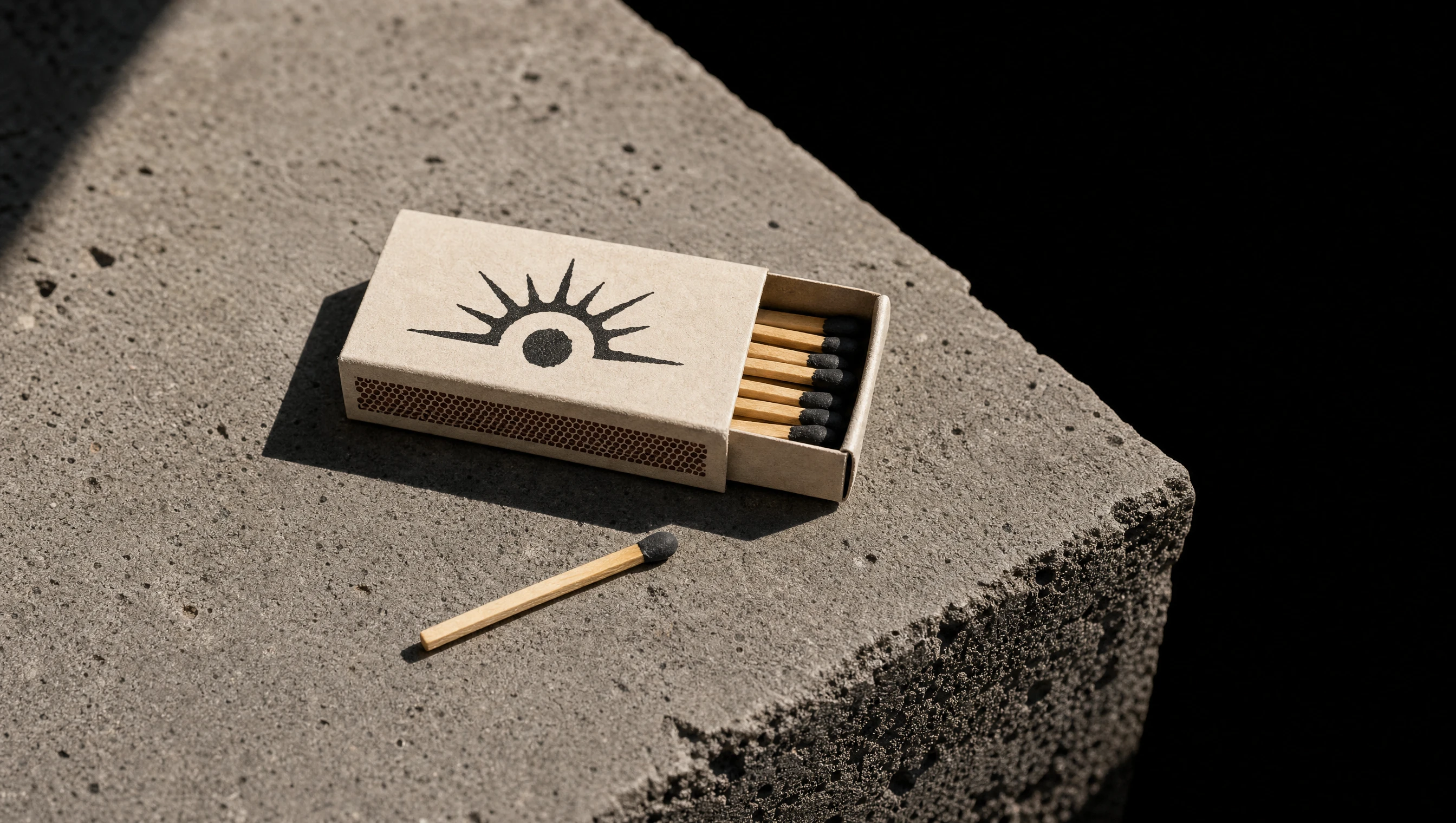
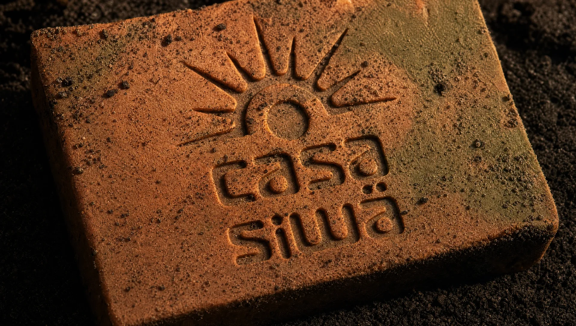
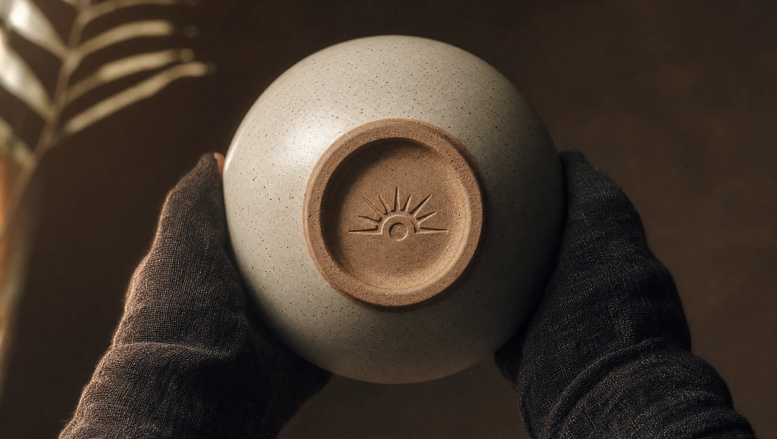
The starting point wasn't mood boards or competitive analysis. It was the Bribri visual and oral tradition. The sun is a primary symbol of Sibö's creative force: rising, radiating, imperfect. Not a geometric abstraction but a living mark, pressed into clay, carved into wood, worn on the body. That became the foundation of the wordmark.
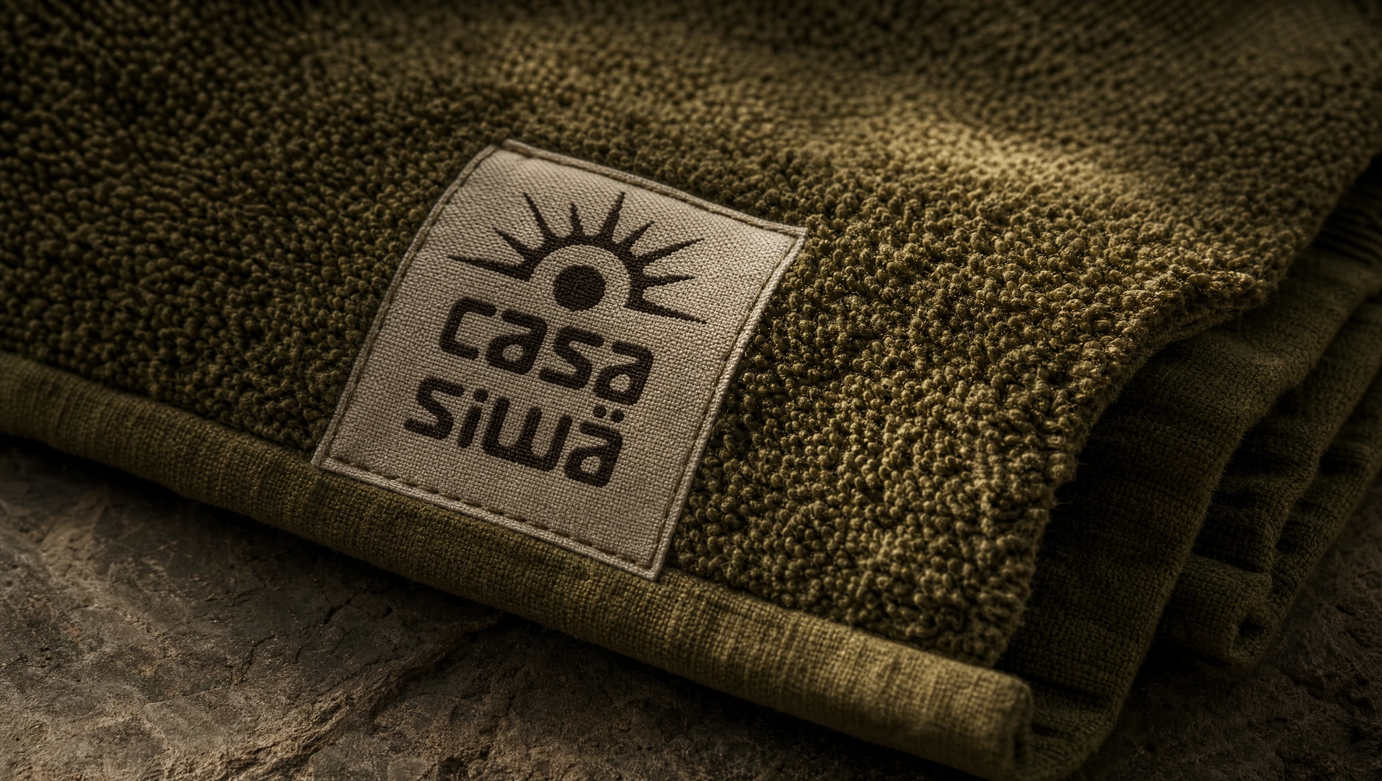
An organic sun with irregular, uneven rays. A dark seed at its center: origin, potential, continuity. The typography followed the same principle: rounded, rooted in the handmade. The palette came directly from the land. Volcanic black, deep jungle green, cacao brown, warm terracotta. Every choice has a reference. None of them were made in a mood board.
The work covered:
- ·Brand identity rooted in Bribri cultural symbolism
- ·Custom wordmark and visual system
- ·Tone of voice and verbal identity
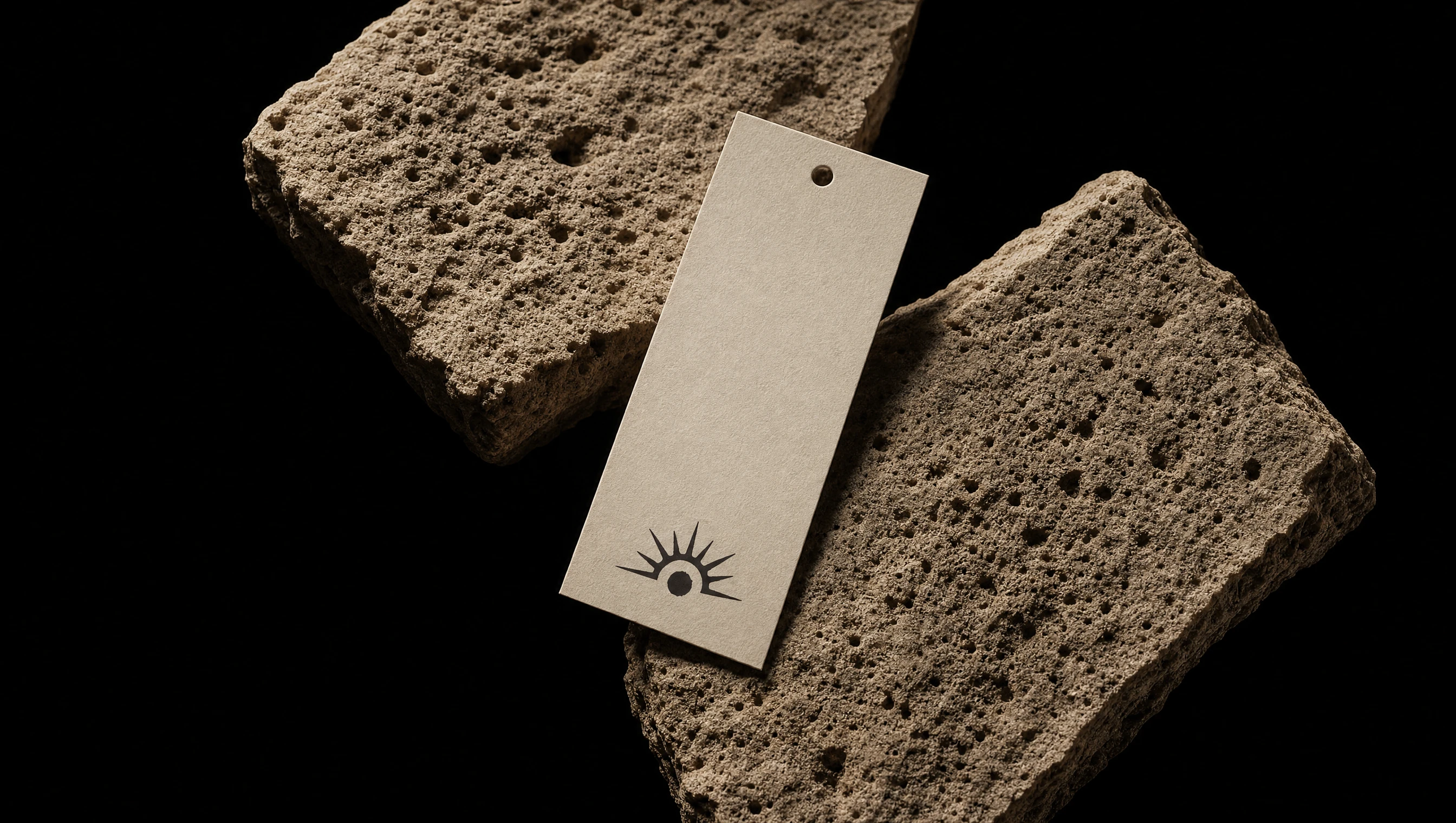
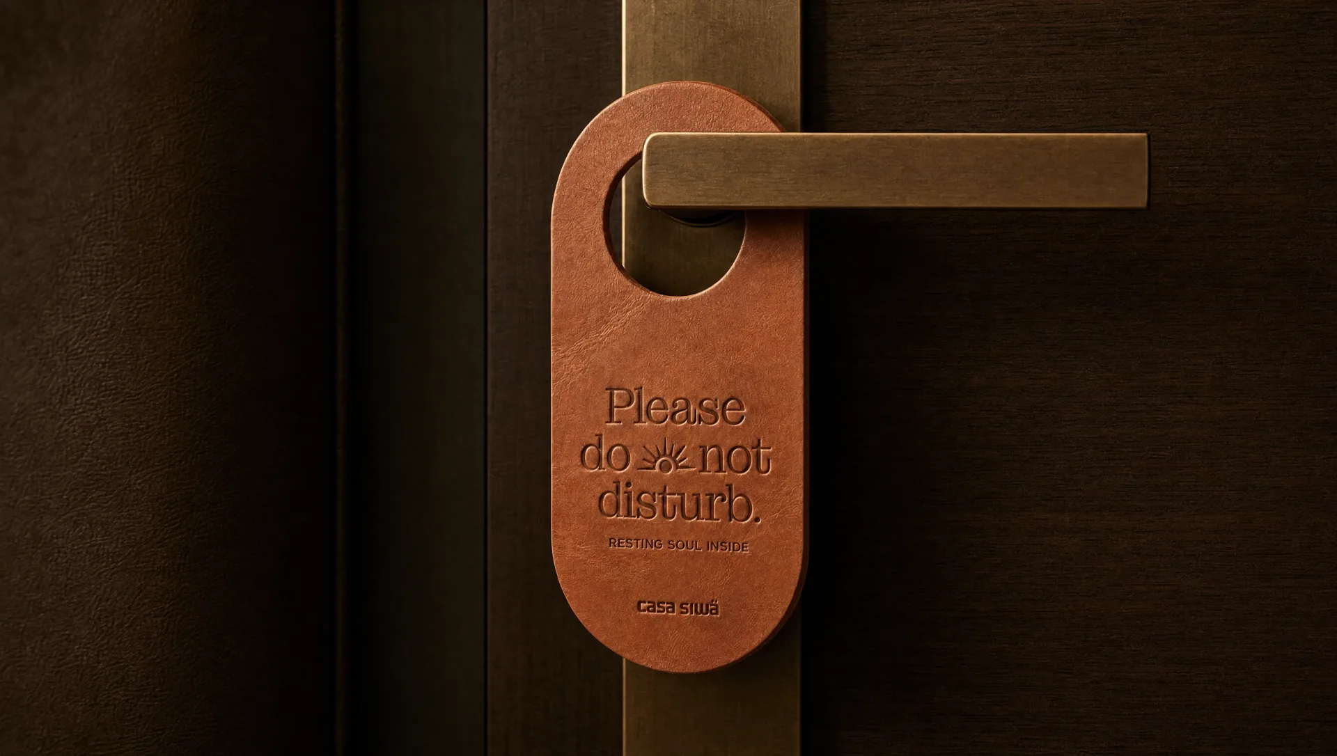
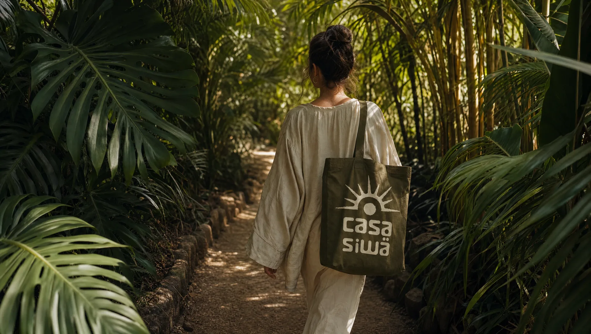
- ·Brand touchpoints: stationery, amenities, signage, apparel
- ·Art direction and visual storytelling
- ·Digital experience strategy

The identity
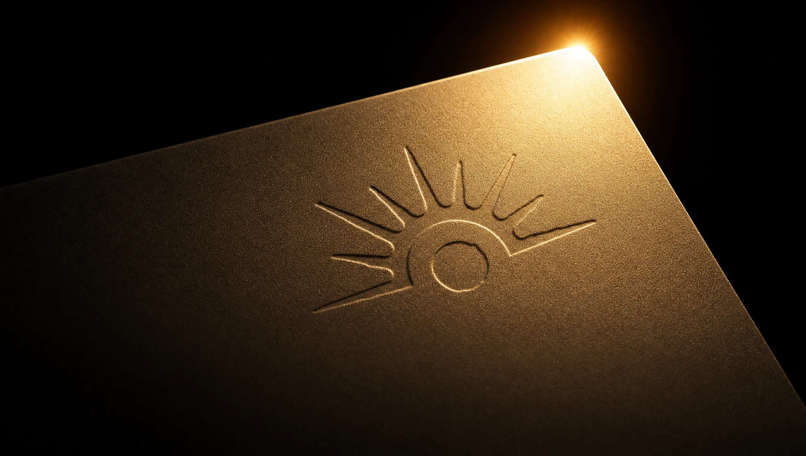
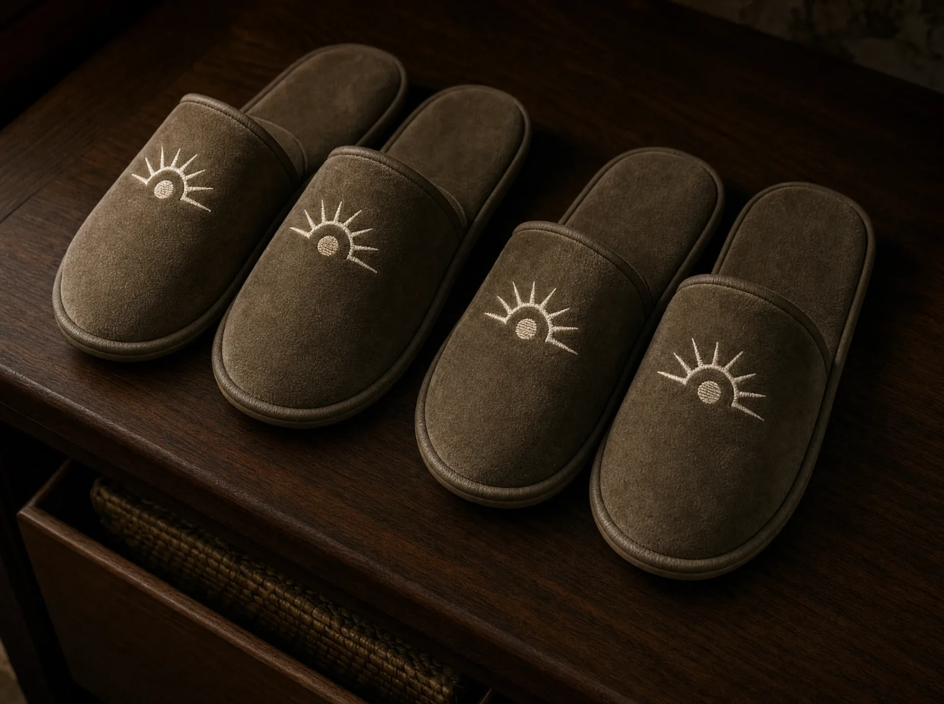
The Casa Siwä mark comes from a specific symbol: the Bribri solar figure, adapted with integrity and built into a complete brand language. The sun's irregular rays are intentional. They carry something precise geometry cannot: the hand, the tool, the person who made them. The seed at the center is Sibö. The space around it is the forest.
Applied across every touchpoint, from embossed soap to woven towel tags to leather key fobs, the mark holds its weight because it isn't decorative. It comes from culture. Guests feel it before they can name it.
What remains
Most hospitality brands spend years trying to manufacture a sense of place. Casa Siwä had it from the beginning, in the land, in the people, in 10,000 years of Bribri culture that shaped every decision made.
What was built isn't a visual identity. It's a language rooted in a real place, a real history, a real people whose worldview lives in the mark on every door. That foundation holds because it isn't a style. It's a lineage.
Featured Work
Featured Work