The build decision was confirmed. The platform had no visual identity, no component conventions, and a thirty-day ship window. Part three was about building the design foundation that made delivery possible at that speed, without adding headcount to do it.
The starting point
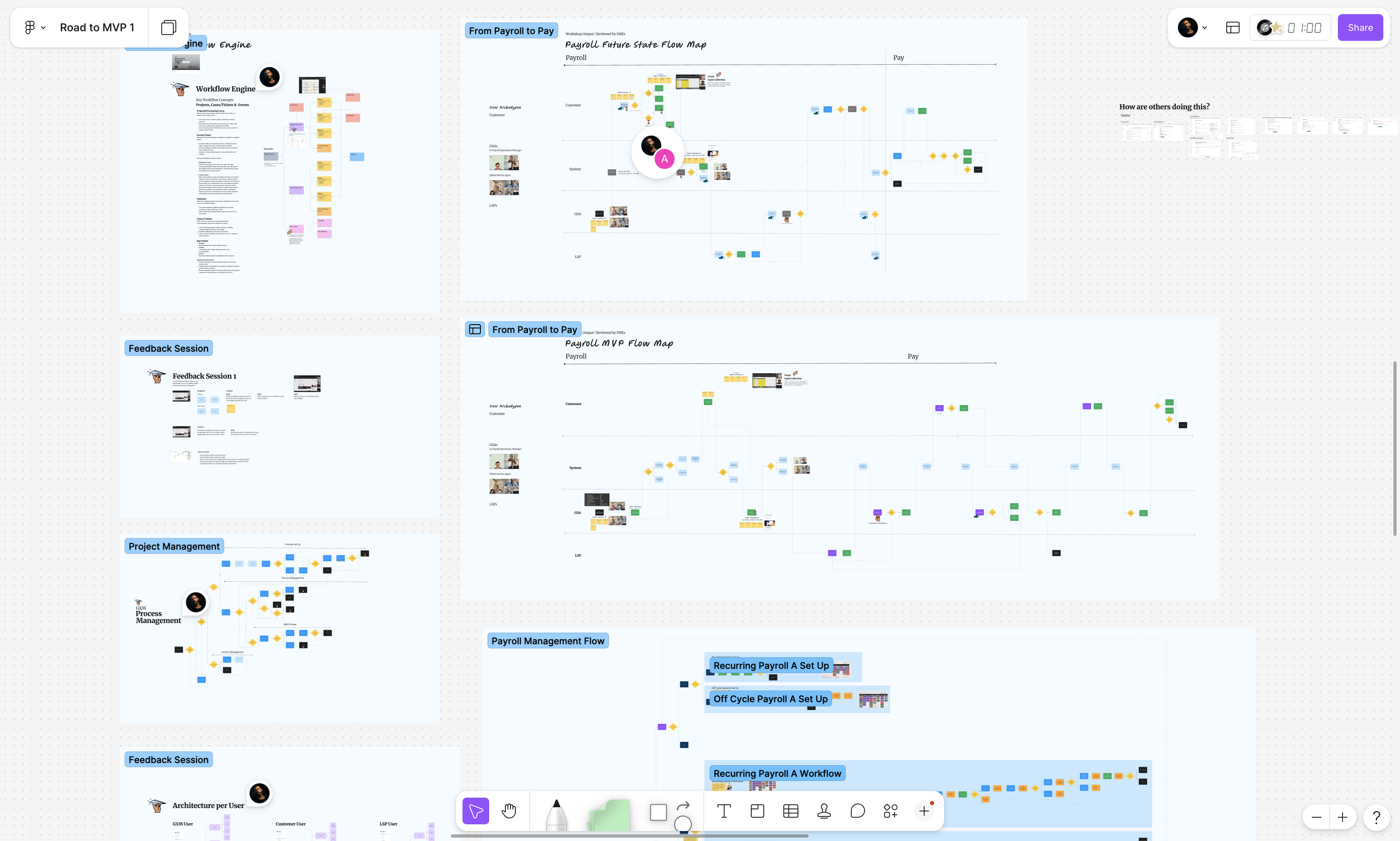
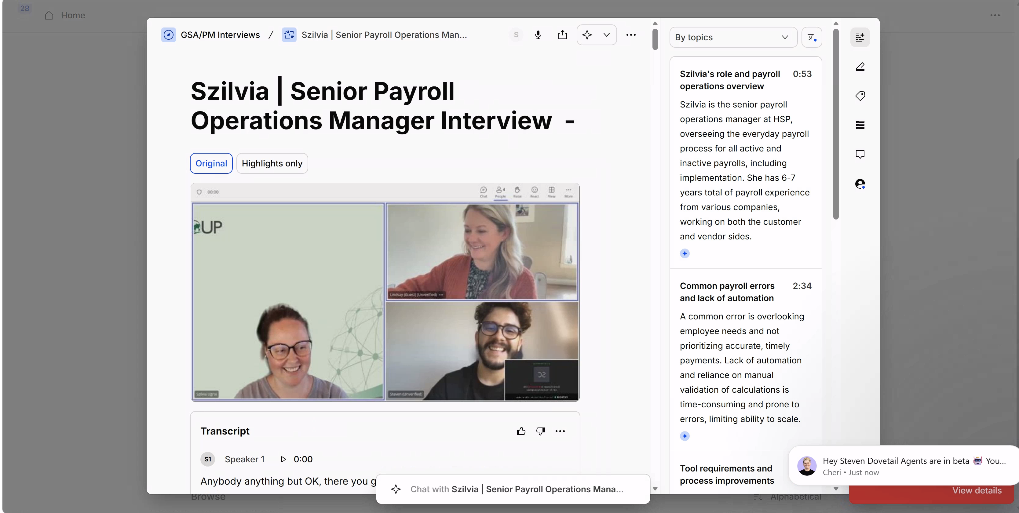
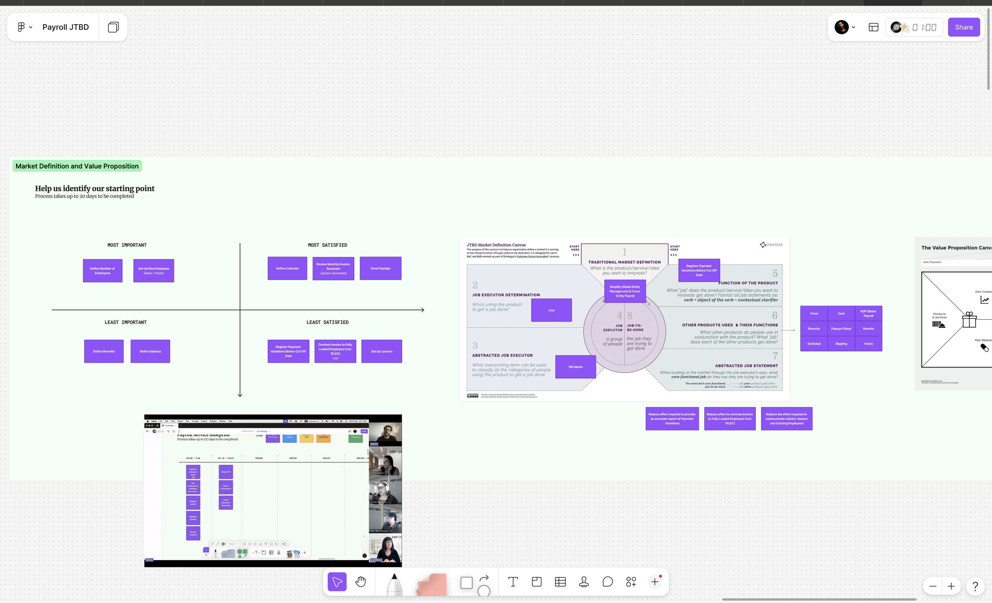
Parts one and two answered whether to build and whether to buy. Part three opened with a different question: what, exactly, does the product need to do? User interviews with legal and HR teams traced the Jobs to Be Done across two service lines: Global Entity Registry and payroll. The goal was not a feature list. It was the operational logic running between roles, the hand-offs and workarounds that kept the service moving before any software existed to support it.
Two interview sprints produced the working material for everything that followed. Service blueprints mapping every actor and touchpoint. User flows derived from how people actually worked, not how the process was supposed to work. An information architecture that the compliance team and the product team could both agree on. That scope became the foundation the design system was built to serve.
- ·Jobs to Be Done mapped across legal and HR for two service lines
- ·Service blueprints completed for Global Entity Registry and payroll workflows
- ·Information architecture and user flows derived from operational reality
- ·Interview recordings reviewed with the full team before design began
The system
The platform had no visual identity. Not a weak one: none. No agreed brand colors. No component conventions. Previous products had been built with inconsistent button types, mismatched inputs, and no shared design language between designers and developers. That context, combined with a thirty-day ship window, made a fully custom design system the most expensive path available. Custom systems offer complete flexibility. They also require a build effort that can consume the exact runway the product needs.
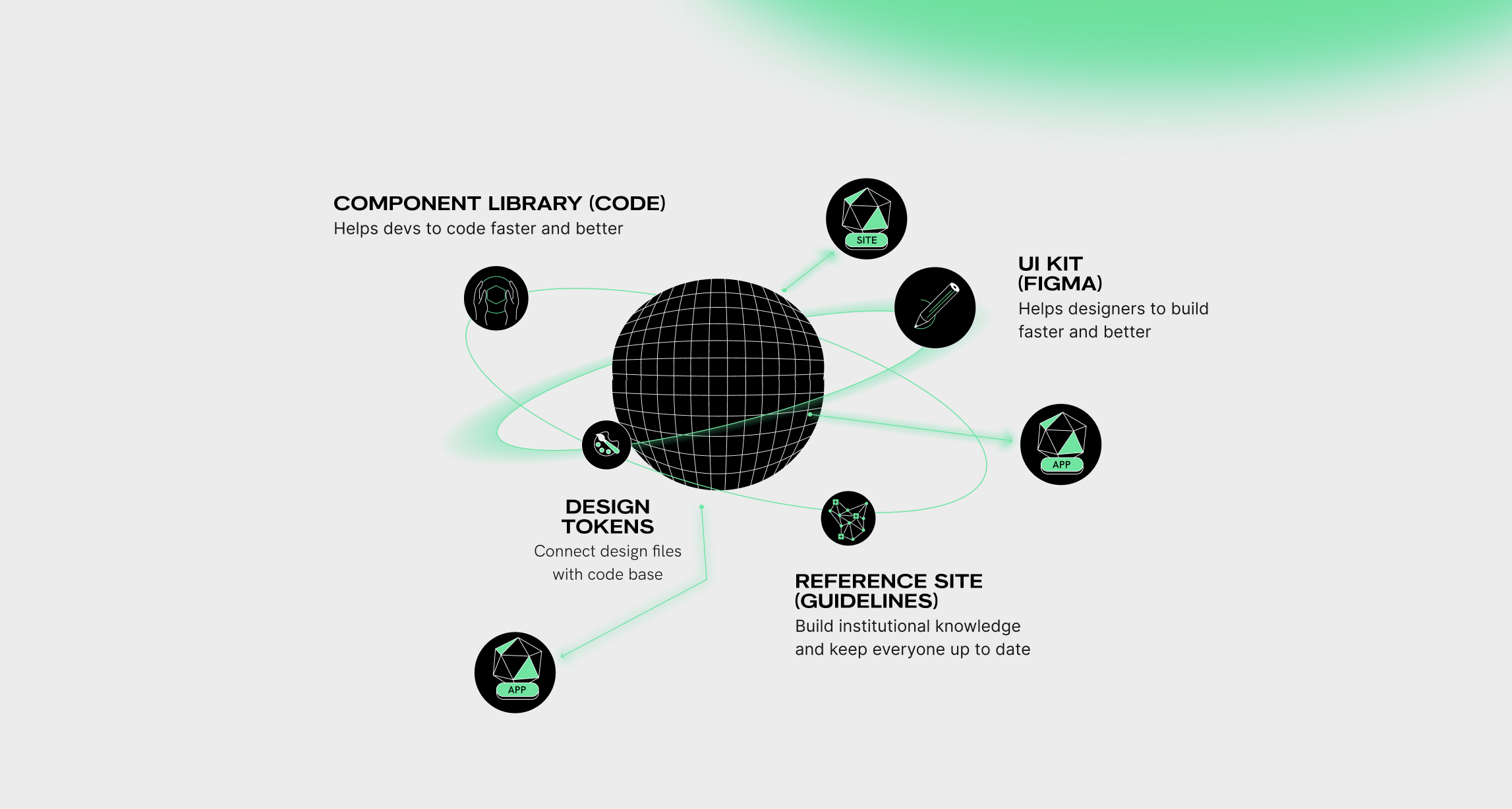
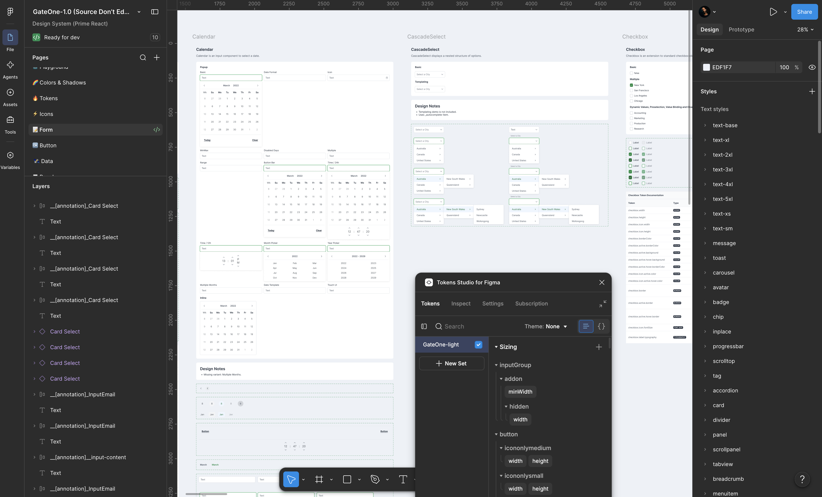
The decision: an existing component library, extended with design tokens. PrimeReact provided the component foundation, a production-grade system covering buttons, inputs, data tables, calendars, and the data visualisation components the platform required. Design tokens provided the brand layer on top. Colors, spacing, typography, and component-level values that aligned the inherited components with the product's visual identity. That decision removed the technical risk of building a component system from scratch, and kept every sprint focused on product decisions rather than infrastructure.
The foundation
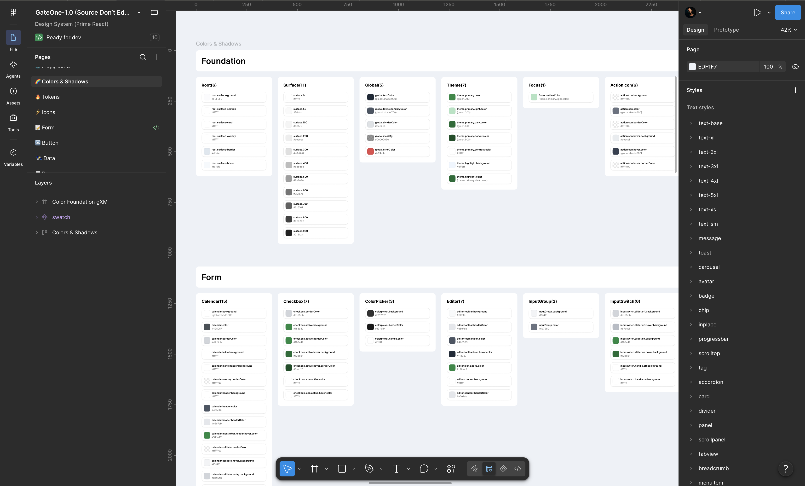
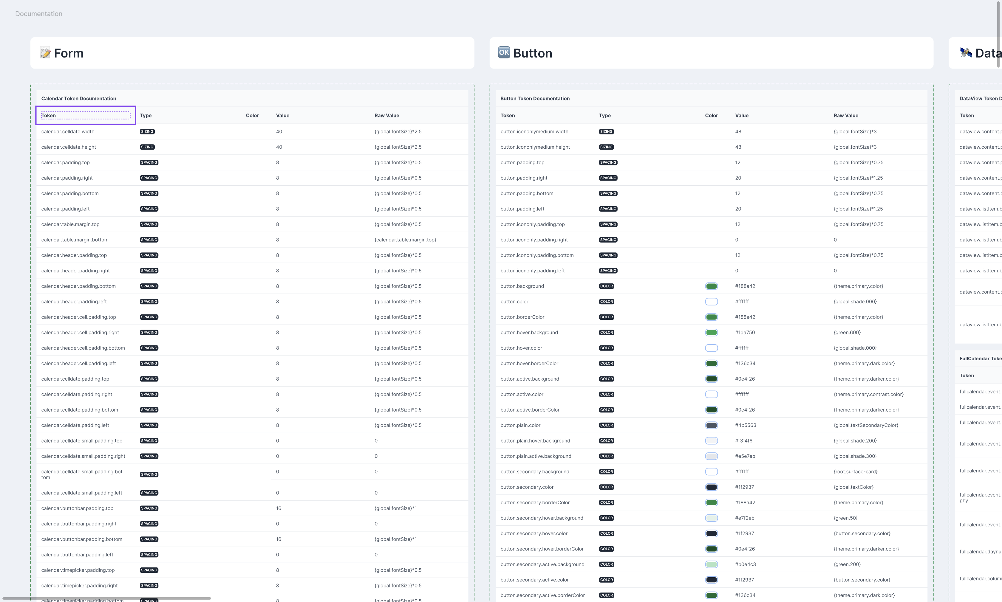
Design tokens are named values: colors, spacing, typography scales. They exist in both the design file and the codebase simultaneously. Token Studio for Figma connected both sides. Every color in the GXM light theme was defined as a token, from global palette values down to component-specific overrides. Every spacing unit. Every shadow. When a value changed in Figma, it propagated to the codebase. Designers and developers stopped working from separate references and started working from one.
The token set covered the full component surface. Calendar inputs, form fields, checkboxes, buttons, data tables: each component had its own token map linking every visual property back to the global value it inherited from. That architecture meant the system could be extended without breaking, themed for future products without rebuilding, and handed to a development team that could immediately understand what they were implementing. Not because it was explained. Because it was structured to be self-evident.

The build
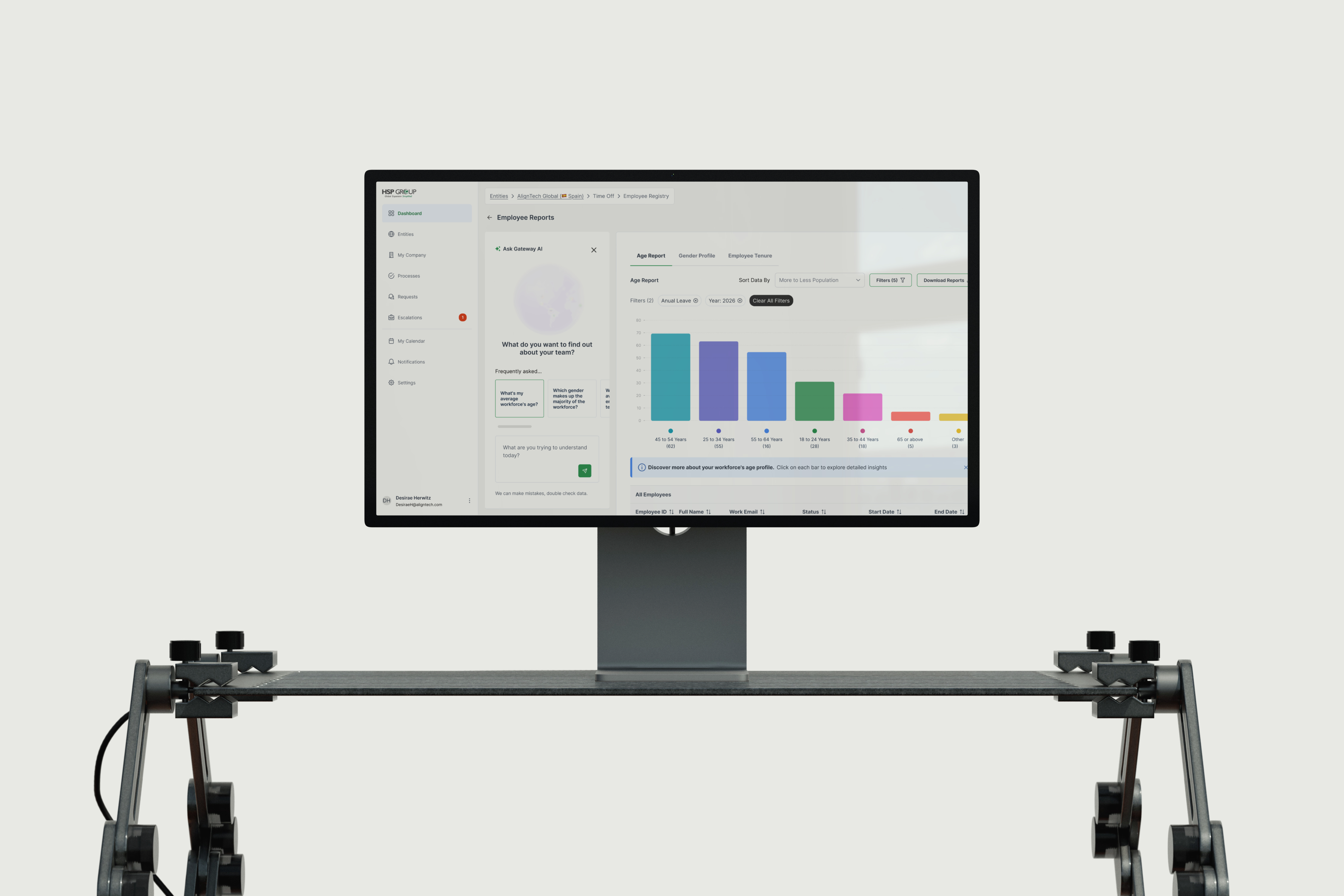
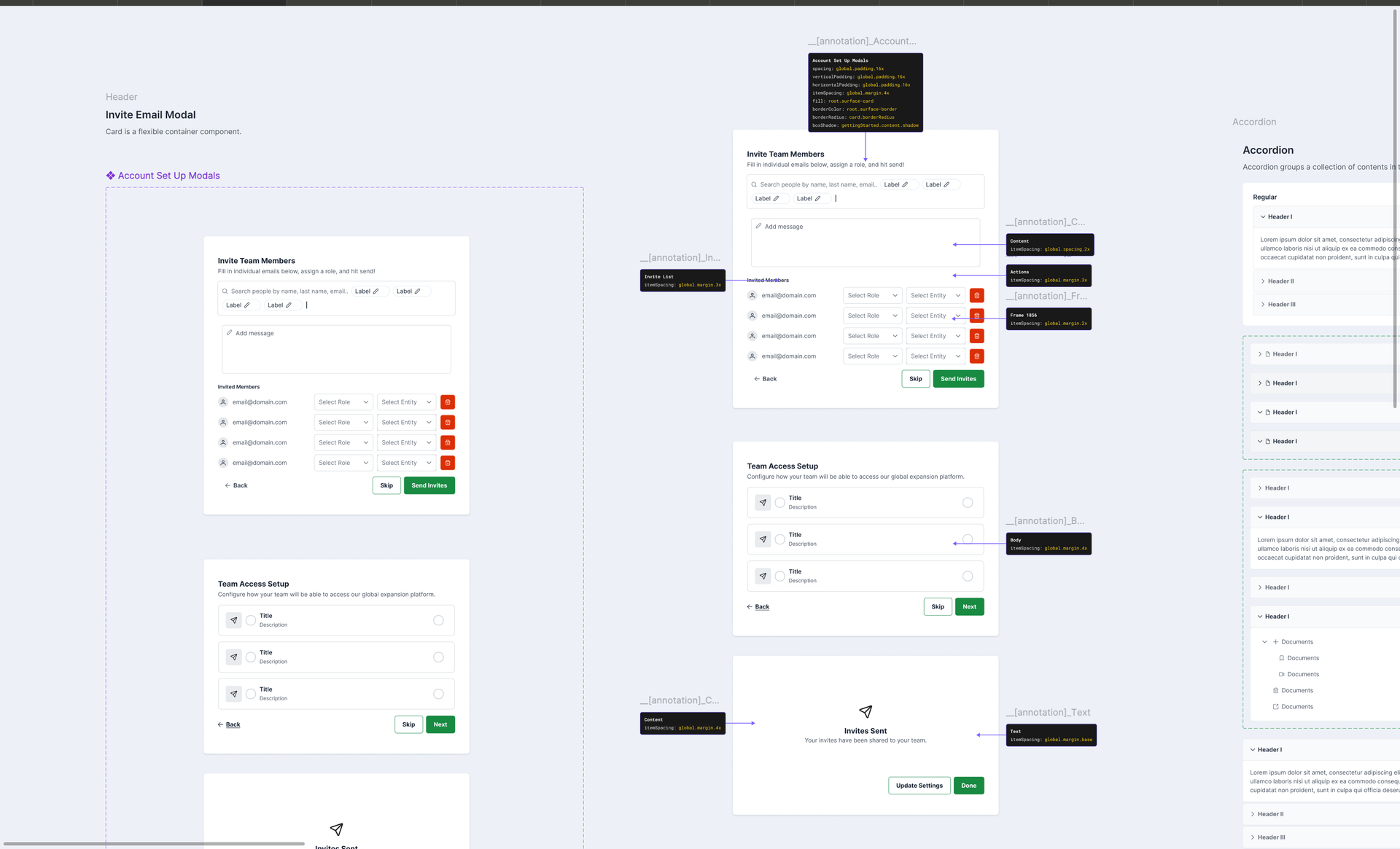
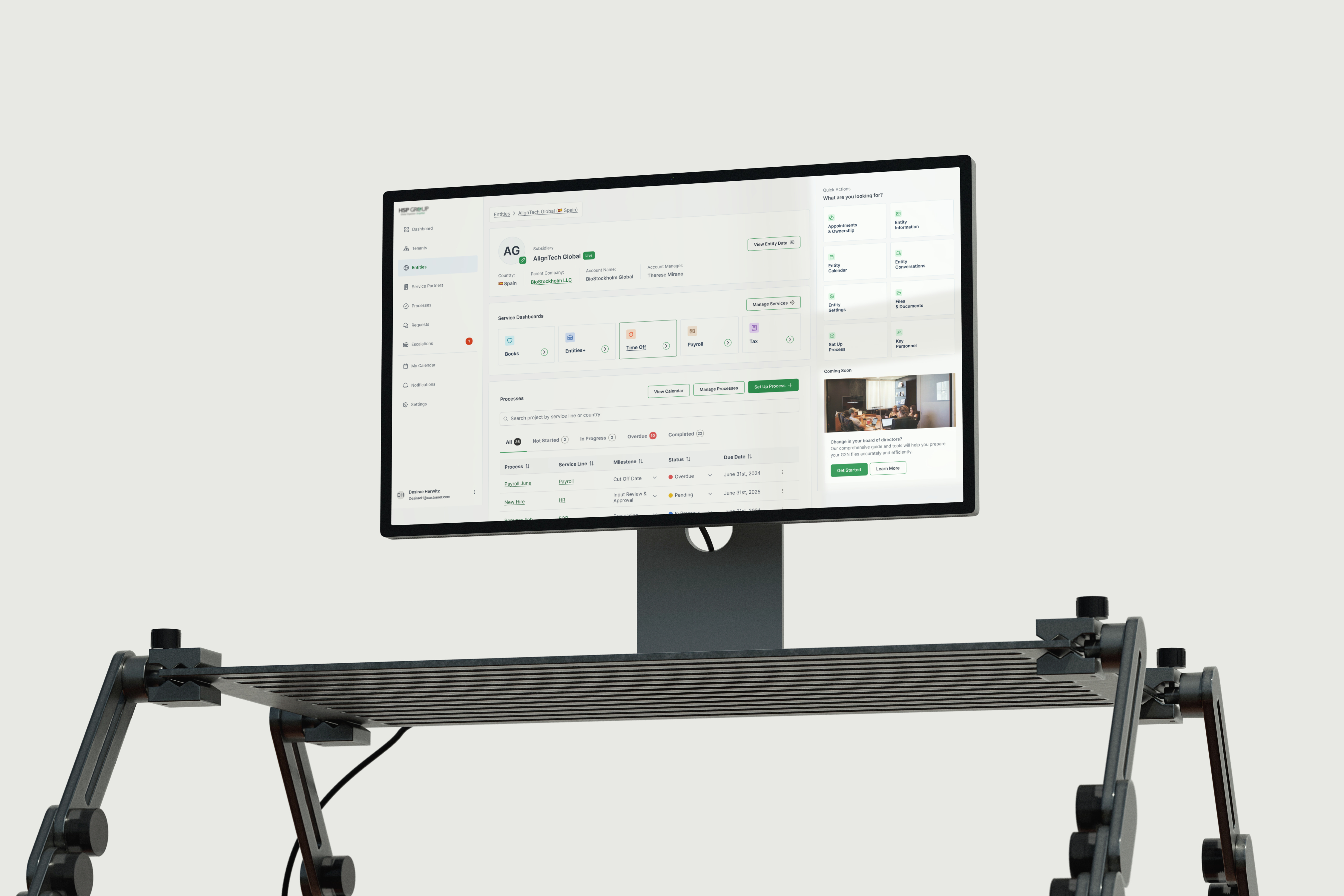
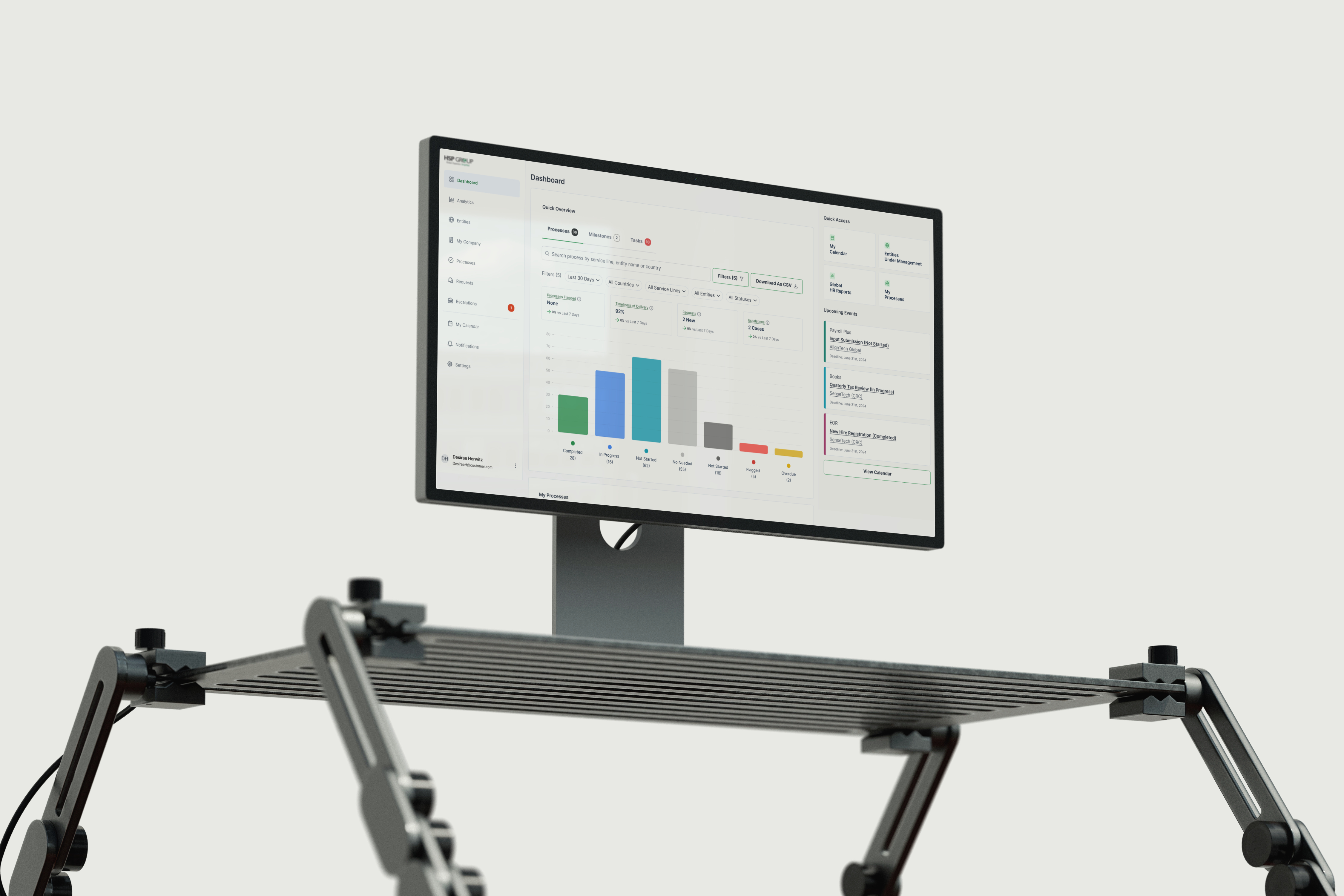
The first screens put the system to the test. Working from the same Figma library, synced to the live codebase through Token Studio, designers and developers eliminated the interpretation gap that slows most handoffs. What would have required repeated rounds of specification, alignment, and re-specification became a set of shared references that both sides could act on immediately. The design review recording below captures what that collaboration looked like in practice.
Early prototypes built with AI tooling accelerated validation before any production code was written. Teams could test interaction logic and review flow assumptions against the information architecture without waiting for a development sprint. That sequence, system first, prototype second, production code third, compressed a process that typically takes months into a timeline the product had to meet. The screens that came out of it were not starting from a blank canvas. They were built from a foundation designed to support exactly what the operational mapping had revealed.
Impact
The design system was not a deliverable alongside the product. It was what made every other deliverable achievable in the time available. Shared components, synced tokens, and documented patterns reduced design-to-development handoff from a process of repeated clarification to a working environment both sides could move in at the same time.
The outcomes that followed were not the result of working harder or adding more people. They were the result of building the right foundation before the product needed it.
- ·PrimeReact component library themed across the full surface using design tokens
- ·Token Studio sync established between Figma and the live codebase
- ·Color, typography, spacing, and icon set defined from scratch in two sprints
- ·First screens designed, AI-prototyped, and reviewed before production code was written
Go deeper
Every phase built on what the one before proved.
The product shipped because the thinking came first. Start with the decision that made all the others possible.
See the full storyFeatured Work
Featured Work