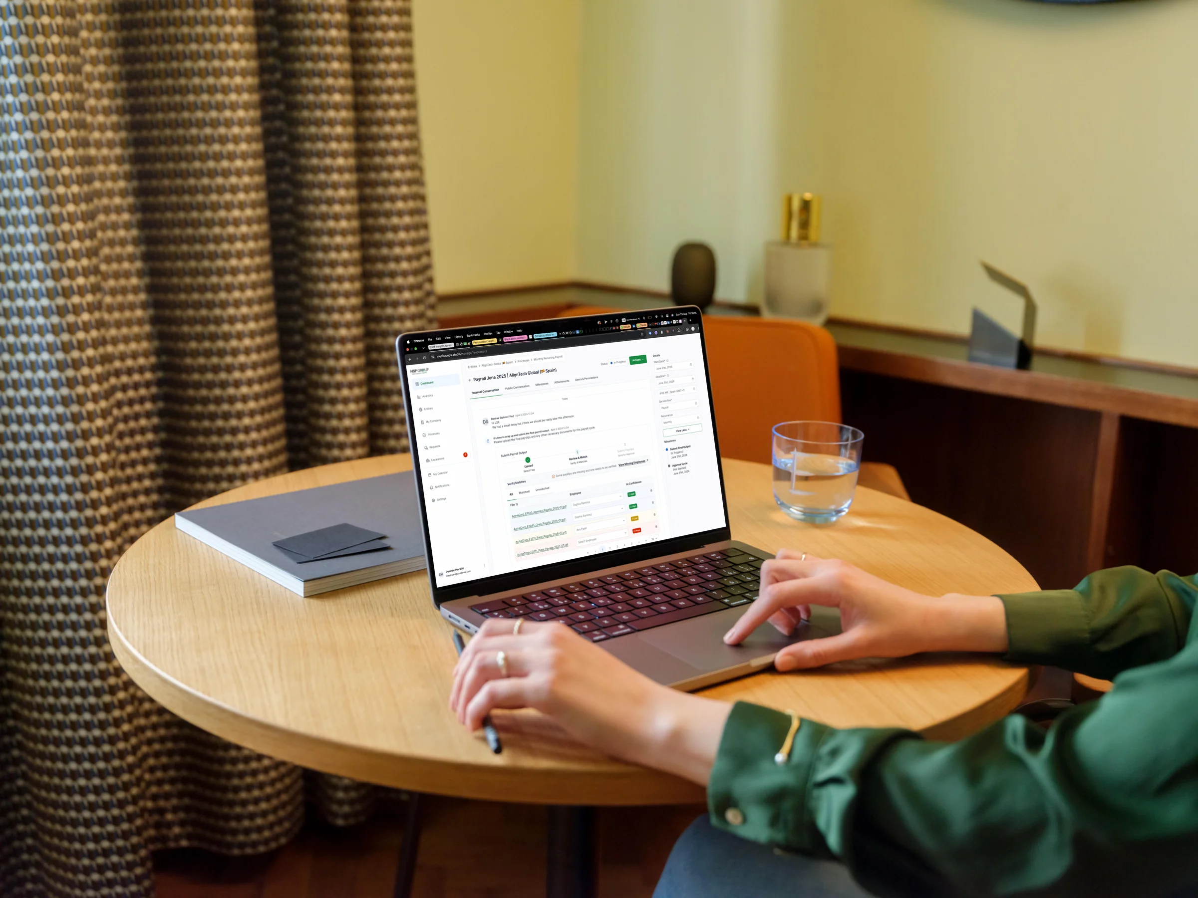
With alignment in place and board support confirmed, the next question was the sharpest one: what exactly are we building, and how do we know it is the right thing? The answer required user interviews, a full audit of the existing platform, and competitive analysis across four market alternatives. All of it before a screen was designed.
The hypothesis
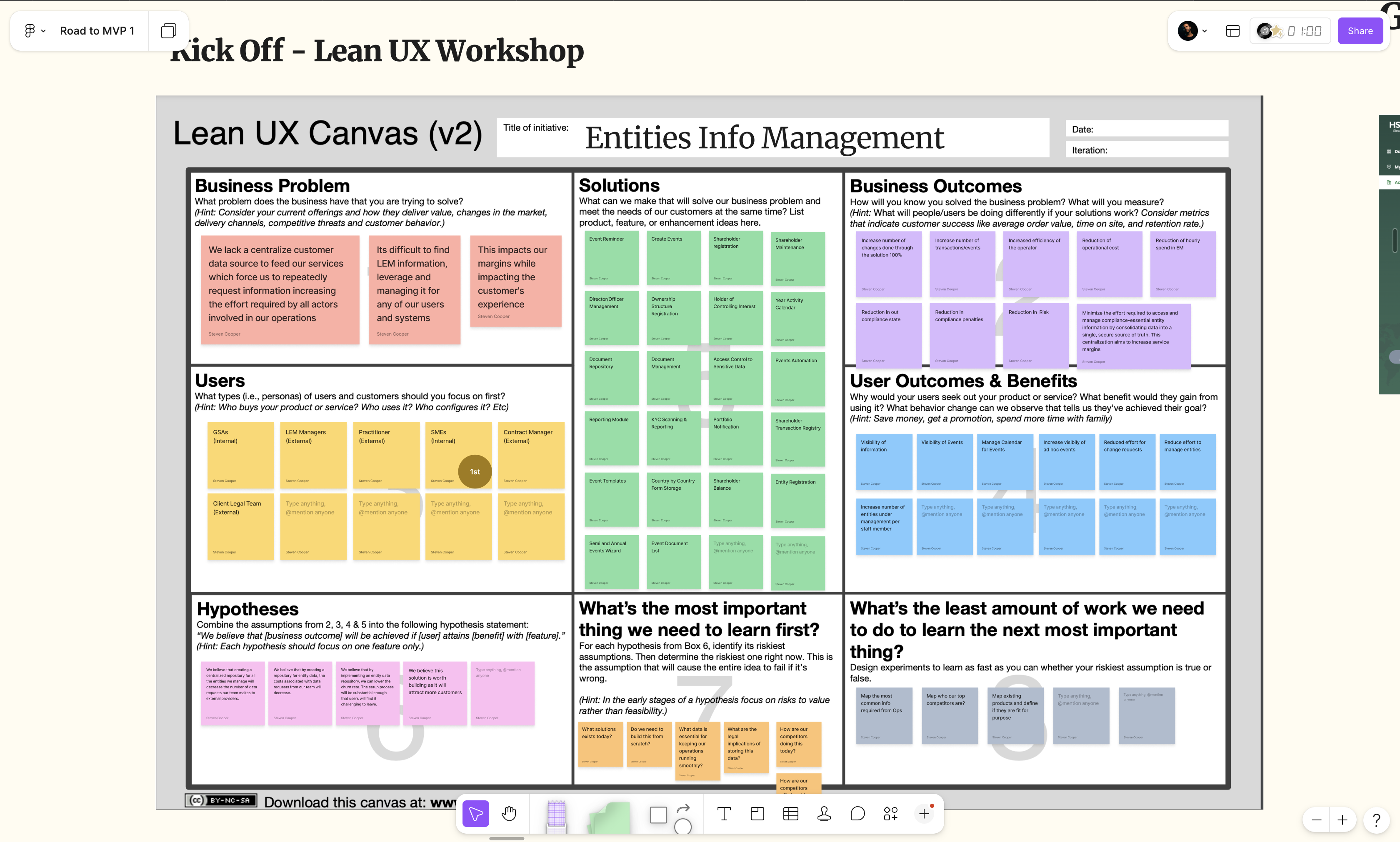
A Lean UX canvas gave the starting problem structure. The specific belief: data that lived in Salesforce was not reaching the people who depended on it. Customers had to ask the team for information about their own accounts. The team had to pull, format, and resend data that already existed elsewhere. That loop created compounding effort on both sides.
The canvas separated what the team knew from what they assumed, and forced one question before anything else: what is the riskiest assumption, and what is the fastest way to test it? The most important hypothesis was not about what to build. It was about whether building was even the right answer.
What already existed
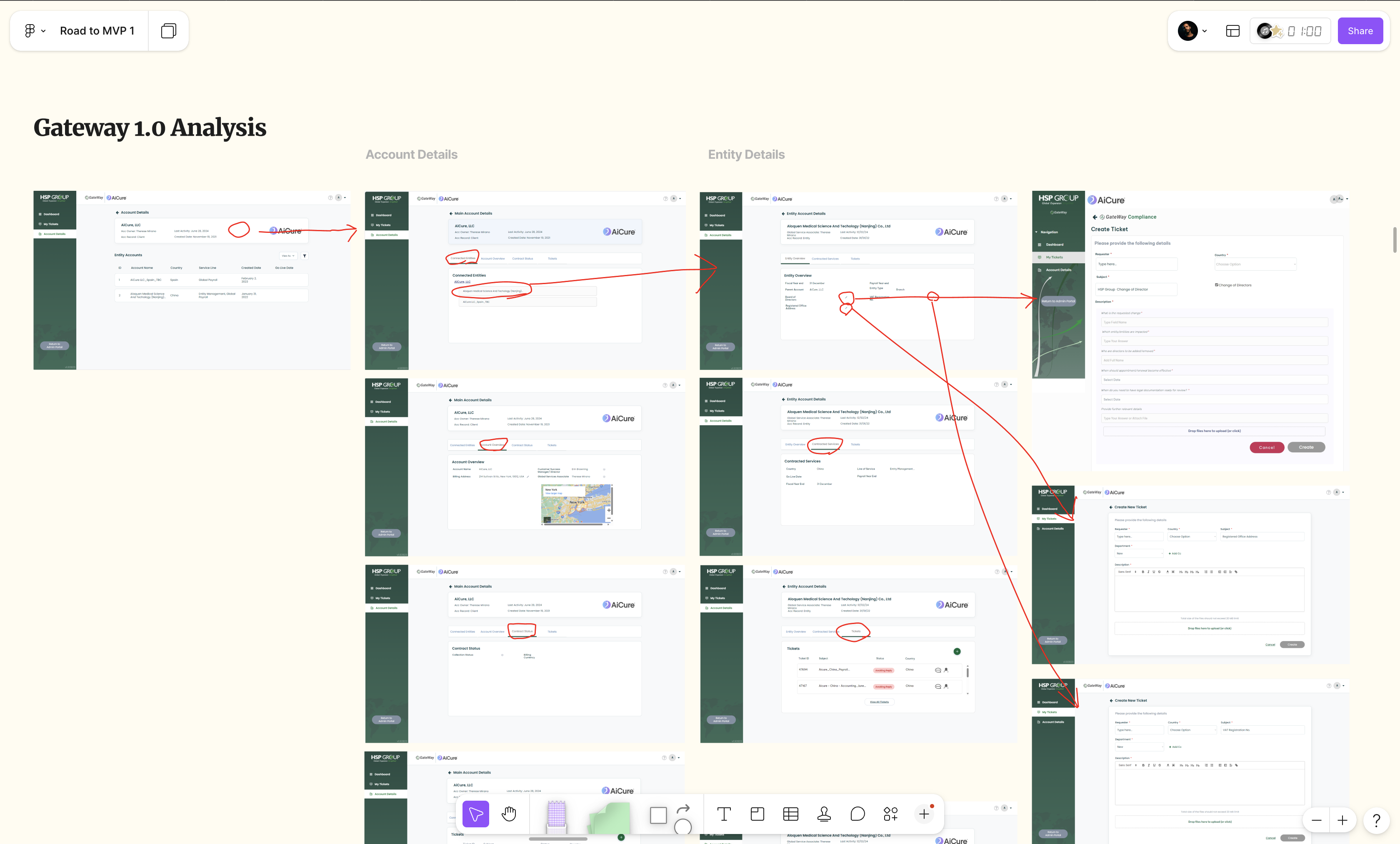
Salesforce held the customer information. A client portal had been built to surface it. Before designing anything new, the existing platform was mapped systematically: every section, every path a customer could take, every point where the experience could be improved.
The findings were specific. The ticketing system displayed oldest messages first, burying the most recent ones. Key account information was missing or unfindable. When the platform couldn't surface what people needed, they chose email instead. Small friction, consistent cost. The audit made the pattern legible.
The research
Interviews ran across two groups: active platform users and those who had chosen email instead. The finding was consistent. When information wasn't on the platform or couldn't be found, people defaulted to email. The ticketing system required scrolling past old messages to reach the newest ones. Small enough to ignore individually, significant enough to change behaviour at scale.
The sessions also surfaced what customers actually needed: the information they reached out about most, what they wished the platform offered, and where the experience had the most headroom to improve.
- ·Platform used rarely; email preferred for most client interactions
- ·Ticketing system displayed oldest messages first, causing users to move to email
- ·Key information missing or unfindable drove repeated manual requests
- ·Interviews identified priority information types and most-requested features
The build vs buy decision
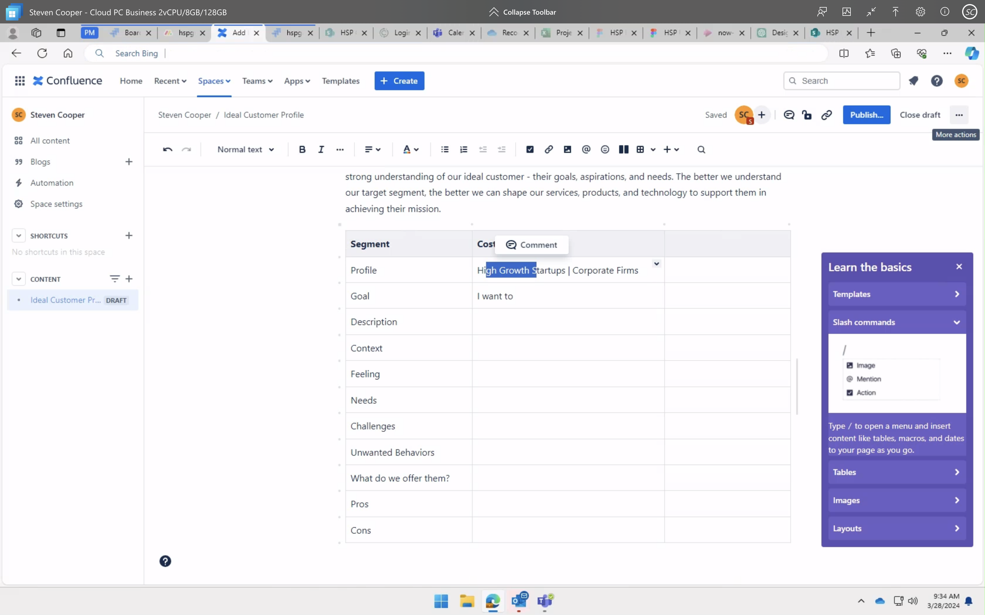
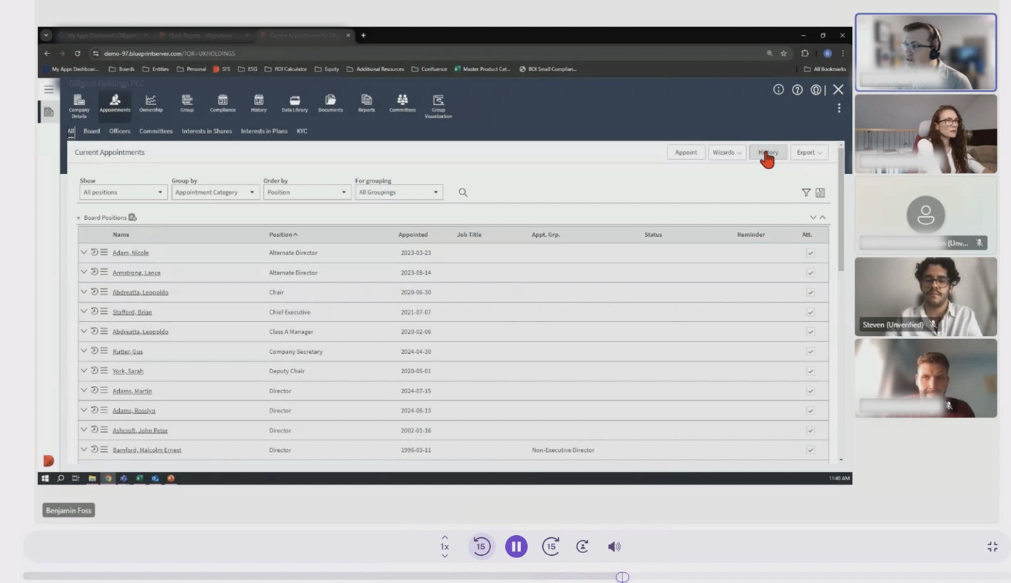
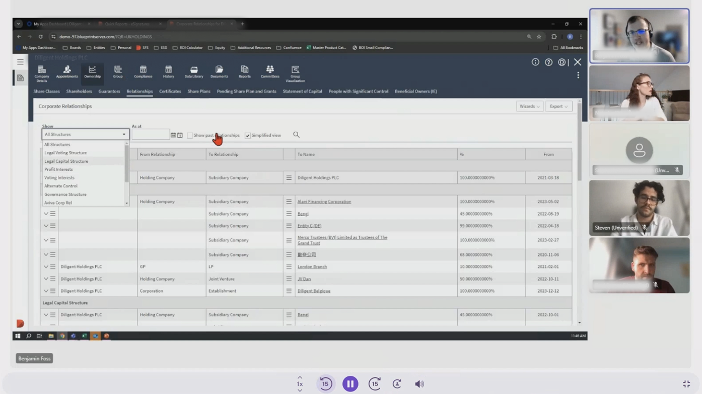
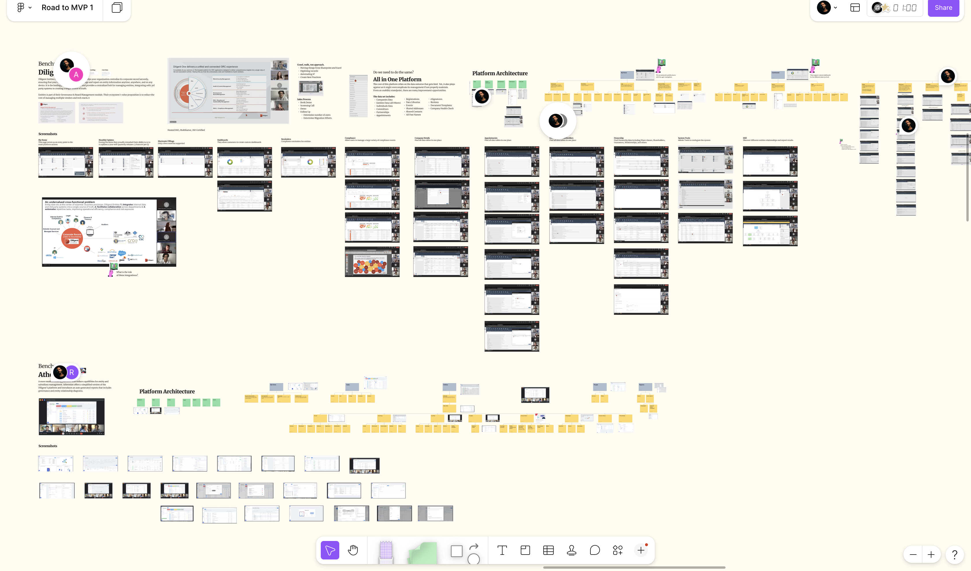
Rather than assume the answer, demos were booked with four market-leading platforms. Their data schemas, feature sets, and sales positioning were reviewed against what the operations actually required. Some came close. But adapting around an external tool's constraints would have introduced costs that outweighed the savings.
The data structures did not match the service model. Entity types, relationships, workflows: none of it aligned cleanly with how the business ran. The competitive analysis did not just confirm the build decision. It gave the team the evidence to defend it at board level.
Impact
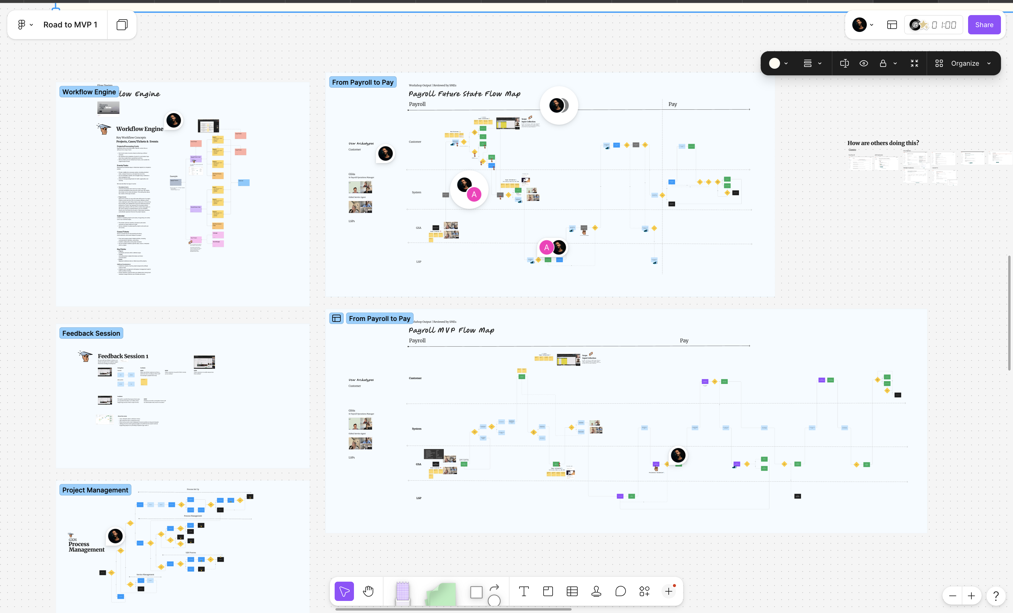
Before a single screen was designed, the team had mapped the hypothesis, audited the existing platform, spoken to users, and reviewed the market across four alternatives. Every decision in the build phase had a documented rationale.
That sequence was the investment. The software was what it bought.
- ·12 user interviews across active and inactive user groups
- ·Full platform audit identifying the root cause of low adoption
- ·Competitive analysis across 4 platforms with live demos and schema review
- ·Build decision backed by evidence, documented for the board
Go deeper
Every phase built on what the one before proved.
The product shipped because the thinking came first. Start with the decision that made all the others possible.
Continue with Next PhaseFeatured Work
Featured Work